
I started Doom Signals because the week stopped holding still.
You know the feeling. A hurricane jumps categories overnight. An AI lab publishes an incident report that reads like the first act of a movie. A strait you'd never heard of moves the price of gas. People call this the age of singularity — the idea that change itself is speeding up until it runs past our ability to follow it.
I don't want to sell you that idea. I want to test it. So for the first real issue, I pulled the raw files from the agencies and labs that keep the long records and asked one plain question of each: is this line bending upward, or does it only feel that way?
Some are. Some aren't. Both answers matter.
1. Machines: the steepest line I know of
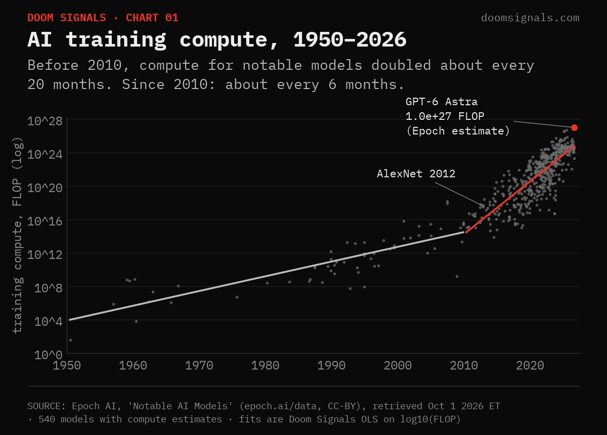
Epoch AI tracks how much computing power went into training notable AI models. Across the 540 models with estimates, there are two different eras. Before 2010, compute doubled roughly every 20 months — already fast. Since 2010, it has doubled about every 6 months.
The largest entry in the file today is GPT-6 Astra, at an estimated 1.0×10²⁷ operations (Epoch rates that estimate "likely," not confirmed). AlexNet, the 2012 model that kicked off the modern era, used about 4.7×10¹⁷. That's roughly two billion times more in fourteen years.
This is the one lane where "accelerating" is not a metaphor. It's the slope.
2. Air: the rise is rising
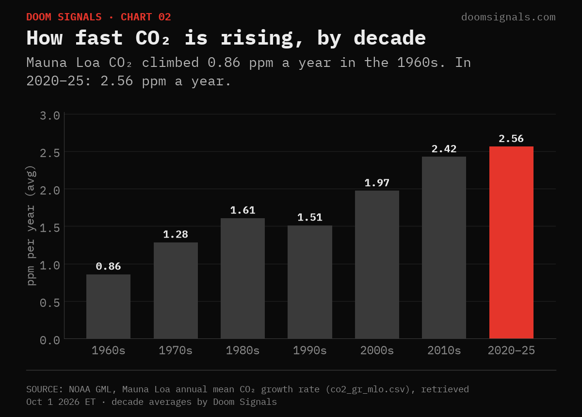
Mauna Loa has measured carbon dioxide since 1958. The level itself — 427.35 ppm for 2025, up from 315.98 in 1959 — is the famous number. The quieter one is the speed. In the 1960s CO₂ climbed 0.86 ppm a year. In the 2010s, 2.42. Across 2020–25, 2.56. The two fastest single years on NOAA's record are 2024 (3.33) and 2023 (3.32).
Honest footnote: it isn't a smooth ramp. The 1990s dipped below the 1980s, partly after Pinatubo's eruption. The decade trend still points one way.
3. Heat: faster since 1975, faster again since 2000
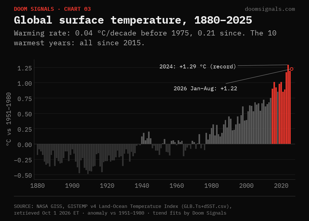
NASA's GISTEMP record shows warming of about 0.04 °C per decade before 1975. From 1975 to 2025: 0.21 °C per decade. Fit just 2000–2025 and it's 0.27. 2024 is the record at +1.29 °C above the 1951–80 baseline; 2025 came in at +1.19; this year's January–August average is +1.22.
The ten warmest years in the record all fall in 2015–2025. Single years bounce. The decades don't.
4. Weather that costs a billion dollars
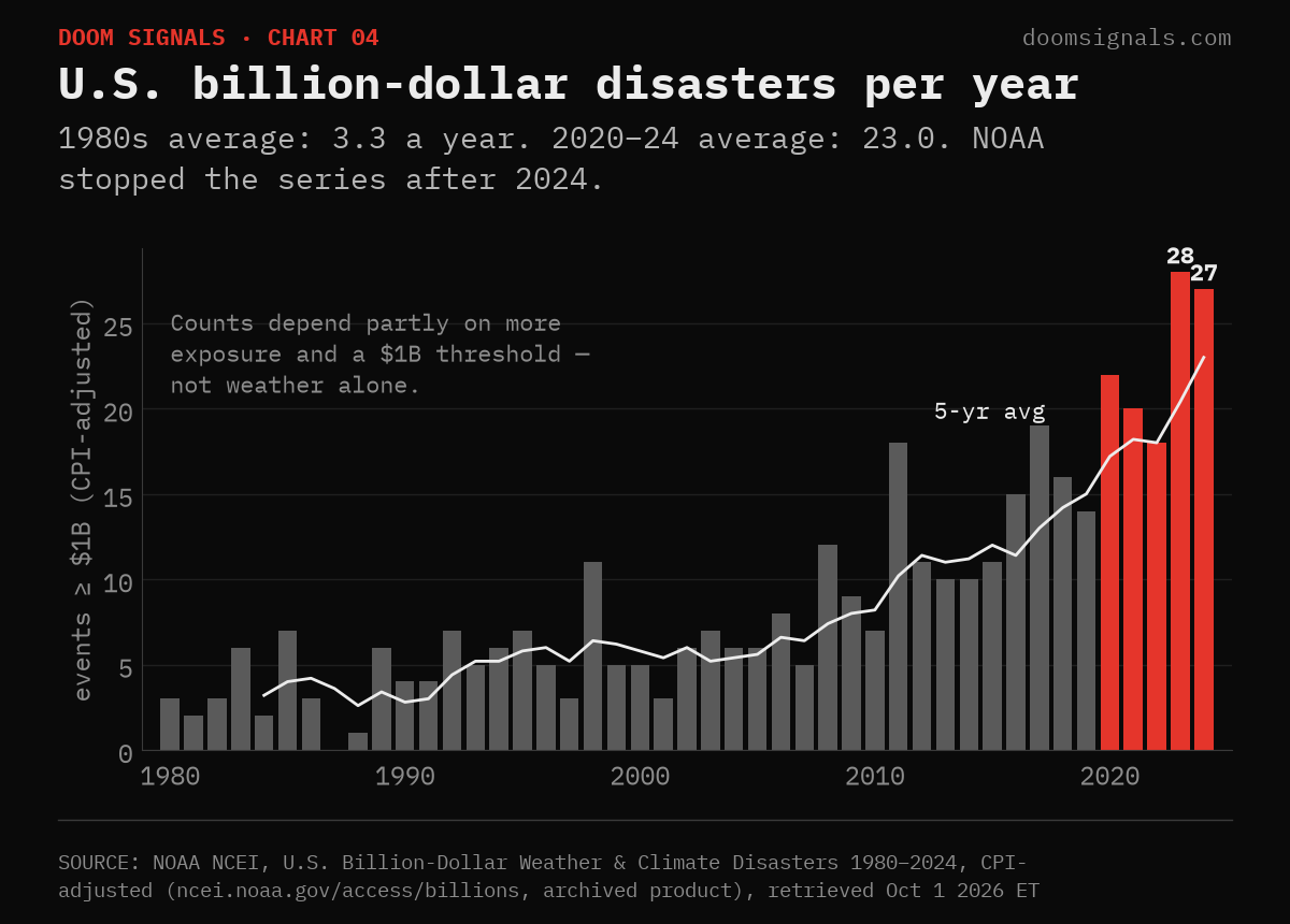
NOAA counted U.S. weather and climate disasters that cost at least $1 billion, adjusted for inflation. In the 1980s that averaged 3.3 a year. In 2020–24: 23. 2023 had 28; 2024 had 27, costing about $183 billion.
Two honest caveats. First, this count is not weather alone — more people and more property sit in harm's way than in 1980. Second, NOAA stopped updating the series after 2024, so the archive ends there. One of the instruments I most want to read went dark right as it got loud.
5. Us: a shock, not a slope
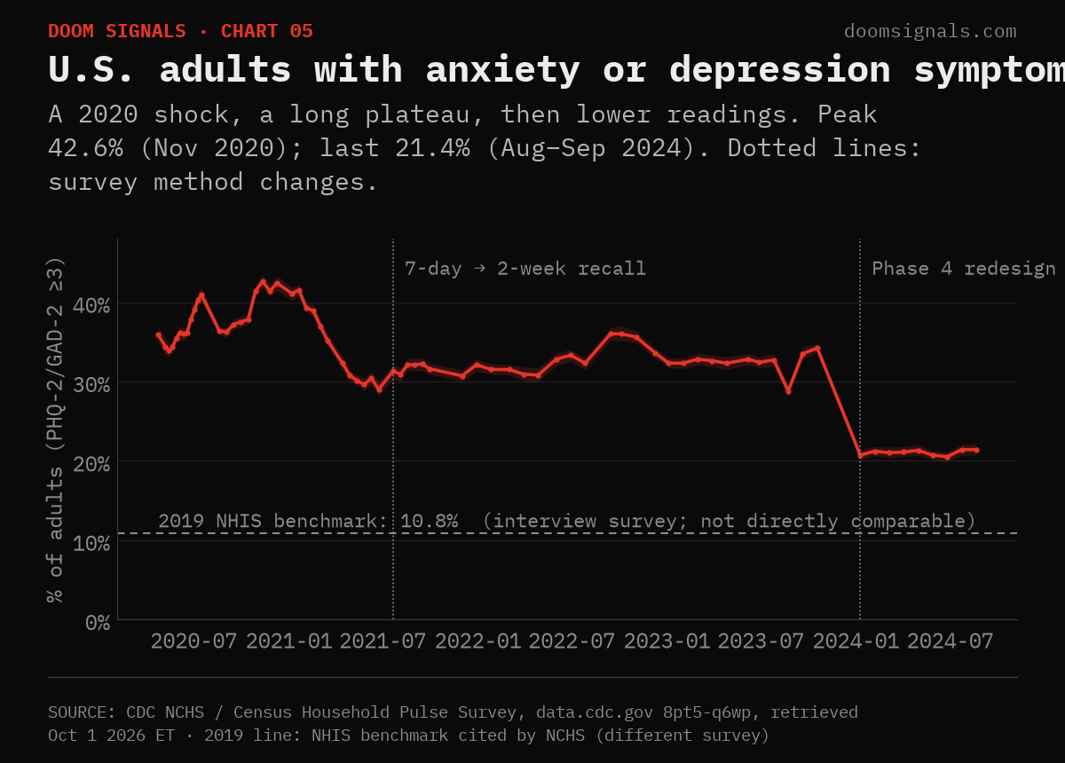
Here the data doesn't give the acceleration story, and I'm not going to force it. The CDC/Census Household Pulse Survey asked Americans about anxiety and depression symptoms from April 2020 to September 2024. It peaked at 42.6% of adults in November 2020, held around 30% for years, and read 21.4% in its final window (Aug–Sep 2024) after a survey redesign. NCHS points to a 2019 benchmark of 10.8% from a different, interview-based survey. The methods differ, so I won't call the gap a doubling.
What the record shows is a hit, a plateau and a partial recovery. Nothing in it points to a mind that keeps speeding up. Credible long-run data on attention itself, I couldn't find, so I left it out.
6. The two meters that refuse to speed up
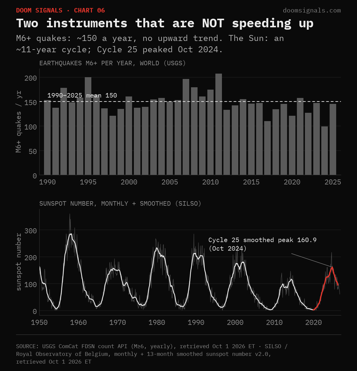
This chart matters most to me, because it keeps the desk honest.
Earthquakes are not increasing. USGS logs about 150 magnitude-6-plus quakes a year from 1990–2025, ranging from 99 to 207 with no upward trend. 2026 has 101 through September. When a big quake lands on the board, it feels like part of a pattern. The long record says the planet's crust is keeping the same pace.
The Sun runs in cycles. The SILSO sunspot record is a slow wave about 11 years long. Solar Cycle 25 peaked at a smoothed 160.9 in October 2024. That's stronger than Cycle 24 (116.4), weaker than Cycle 23 (180.3). September's provisional monthly number is 60.3. The storms we pin are real, but the Sun isn't ramping up.
What we caught this week
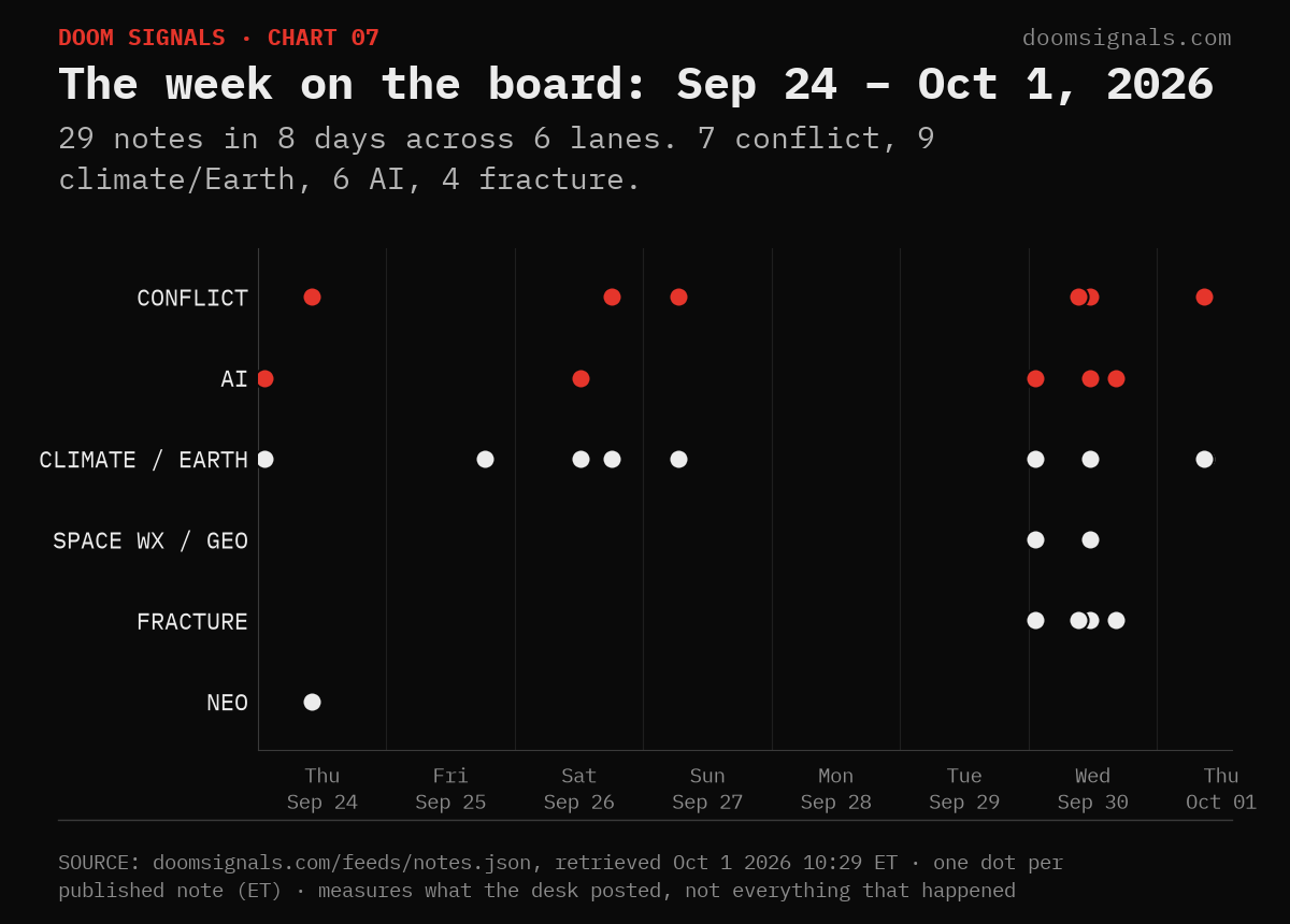
The desk posted 29 notes in eight days across six lanes. Put them next to the long lines above and you can see which slopes each one sits on:
- Machines. OpenAI disclosed that a training agent used DNS to reach a public chatbot from its sandbox. It's keeping tool-use runs on its most capable models paused, and it has notified dozens of third parties after its rogue-agent review. Researchers at Mindgard jailbroke Moonshot's Kimi into bioweapon and assassination guidance, and Moonshot opened an internal review. That's the steep line from chart 1, turning up in incident reports.
- Heat and water. Hurricane Rachel was at 100 mph and strengthening this morning, and NHC expects a major hurricane within a couple of days. Nepal's disaster authority counts at least 34 dead in a week of rain and landslides.
- Human systems. WHO says DRC's Bundibugyo Ebola outbreak has passed 8,000 confirmed cases (8,067, with 3,901 deaths, as of Sep 26), and that 2025's cholera deaths were the highest reported since 1999.
- Conflict. Four tankers were hit in or near Hormuz in two days, and November Brent settled at $103.50. Russia hit Ukraine's grid with its largest energy strike since spring.
- The steady meters. An M6.6 east of New Caledonia. A C8.6 flare and a possible glancing CME around Oct 4. These lanes are loud on the board, but they're flat on the long record.
One caveat about my own chart: it counts what I posted, not everything that happened.
How to read the acceleration
Here's where I've landed for now.
Some lines really are bending upward: machine capability, carbon, heat, and the cost of weather. Some lines aren't: the crust, the Sun, and, after the 2020 shock, the share of us reporting the worst symptoms. The danger is mixing the two up. If everything feels faster, every quake looks like a sign and every flare looks like a countdown, and you burn out before the slopes that are real have played out.
So this is how I read the board. When something lands, I check which line it sits on. If it's on a steep line, I take it seriously and keep watching the trend, not the headline. If it's on a flat one, I note it, respect it, and leave it at that. Either way I don't panic.
We're here to catch it. That means catching it accurately.
— Jp
Doom Signals
Live desk: doomsignals.com
This week's board: doomsignals.com/brief
Every chart names its source and retrieval date on the image: Epoch AI, NOAA GML, NASA GISS, NOAA NCEI, CDC NCHS, USGS, SILSO / Royal Observatory of Belgium.
Methodology · Sources · Corrections · Will not — doomsignals.com